

End-to-End Branding & Web Design Project
I created a complete brand system for Frozen Fantasy, an ice cream truck company. The project includes logo design, brand personality, color palette, food truck graphics, loyalty cards, and a website.
Project Details
3 month duration
Role: Brand system design, UX research, Web design
Tools: Adobe Photoshop, Illustrator, Figma, Procreate, Miro
Outcome: Brand system, website design
Introduction

Frozen Fantasy is an ice cream food truck company that I had the opportunity to work with for my senior project. The goal was to create a logo that represents their brand, a unified color scheme, truck design, a website, and business cards are all part of the project's visual identity creation process.
Frozen Fantasy seeks to build their brand around joy, community, and togetherness like a summer picnic or neighborhood BBQ for people of all ages by drawing inspiration from themes of hospitality and warmth.

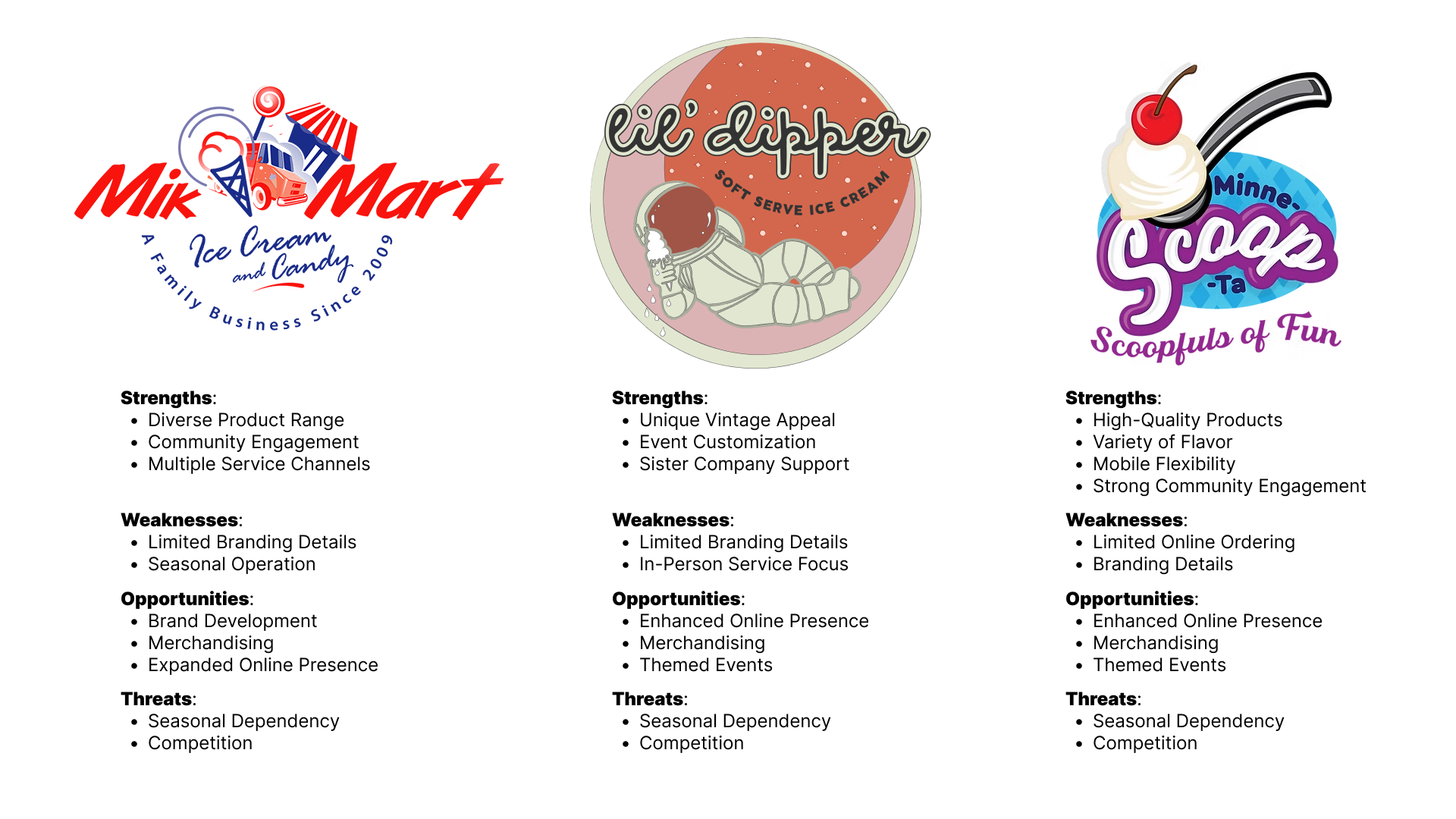
Research
The first research step was a market and competitive analysis which involved examining local ice cream truck companies within Minnesota in order to find visual patterns in the brands, lost opportunities, and trends in the ice cream business. This research is crucial to finding out customer needs and understanding business needs as well.
Ten participants were interviewed, five of whom were between the ages of 6 and 16 and five of whom were between the ages of 18 and 50, in order to gain a better understanding of customer preferences and emotional connections with ice cream related experiences.
Interview Insights
Ice cream was described as comforting and nostalgic for most participants. Pastel colors were commonly preferred and suggestions of a memorable mascot were highly requested. Design choices regarding Frozen Fantasy's branding were influenced by these insights.
“Ice cream trucks make me feel nostalgic and happy, like childhood summers.”
Personas
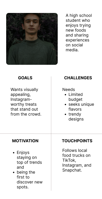
Four adult user personas were created in order to further understand the customer and business needs. One persona stands in as a parent with two kids that wants to create memories with their children while also searching for reliable and affordable products. Another persona is an event coordinator who appreciates skilled, imaginative catering that can help support their vision for events. Another persona focuses on a millennial who prefers high quality products that look aesthetic for their personal social media and the last persona focuses on a high school student who’s goals are driven by social media sharing and is searching for inexpensive, trendy sweet.


Design
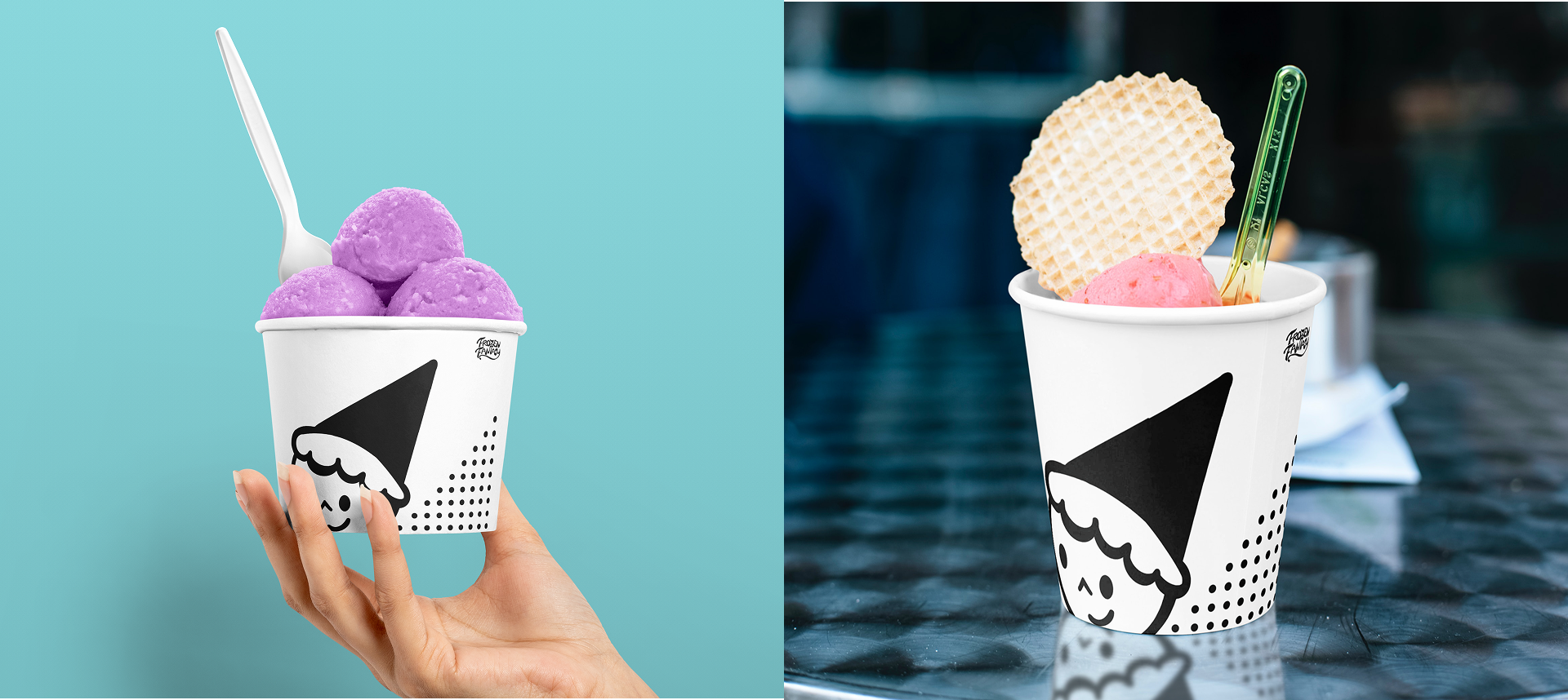
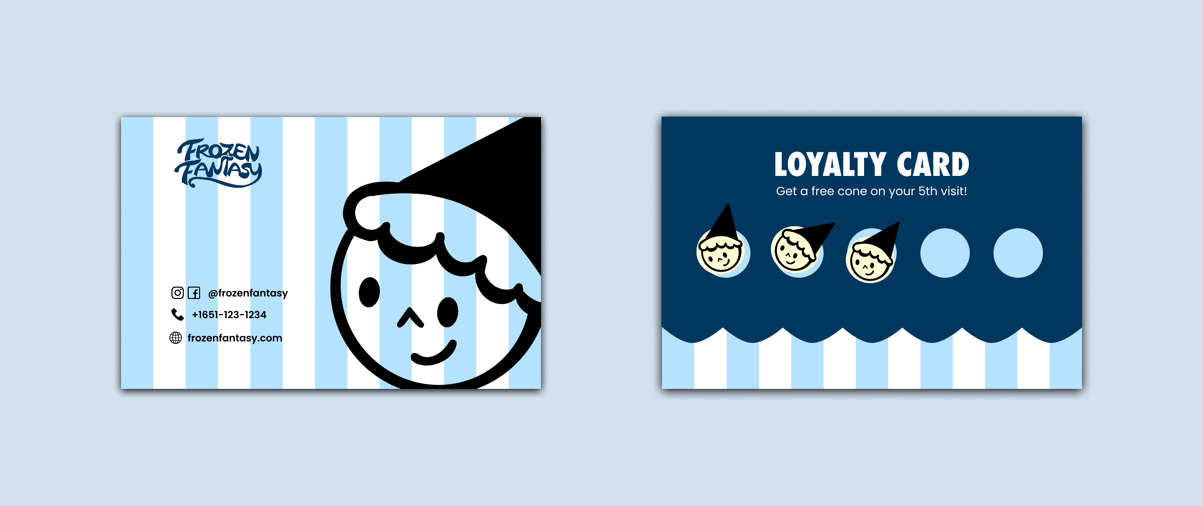
The first step in the process was creating the logo, which was meant to capture the inviting and warm direction the business wanted to go. An upside-down ice cream cone serves as the mascot’s head in the final logo design. The cone also serves as a wizard-like and a gnome cap. A simple smiley face adds warmth and friendliness to the mark as well as melting drips detailing the character's hair.

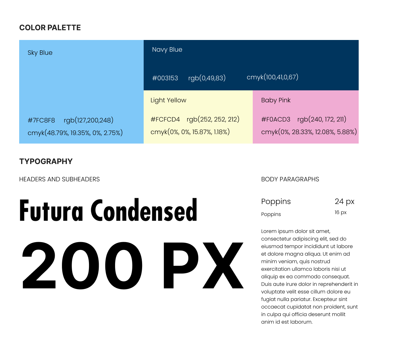
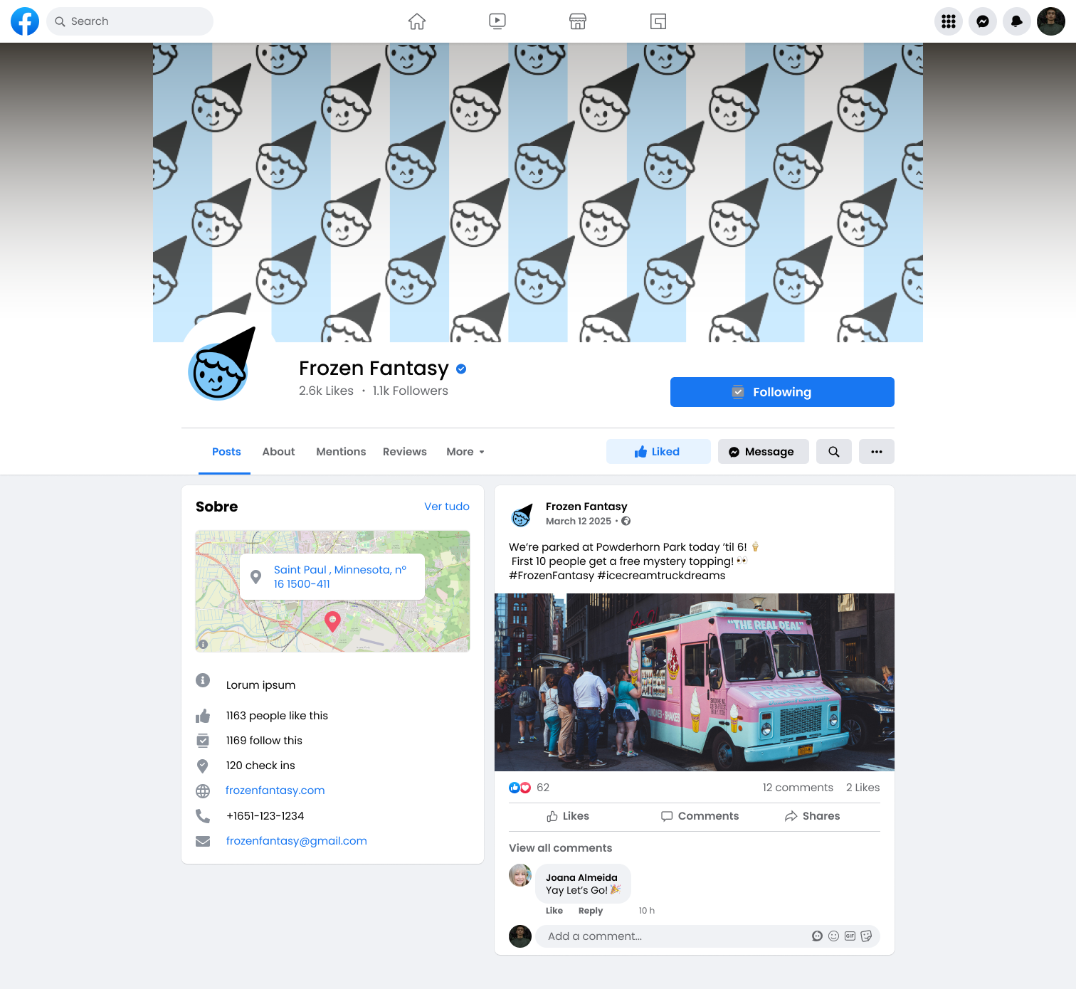
The brand's simple yet lighthearted tone was also supported by the choice of typography. Poppins was selected for body text because it is clear and readable on both print and screen, while Futura, which is used for headers and subheaders, gives a geometric voice that contrasts well with the ice cream logo. These elements worked together to create the visual design system, which was then expanded into material including prototypes of business cards, packaging of serving cups, truck design, social media design, and a website.

A color scheme was created to portray a cold, refreshing sensation as well as a gentle fantasy tone after the logo direction was decided. In keeping with participant preferences for pastels and vintage-inspired colors, the selected palette consists of a soft pink (#F0ACD3), a buttery cream (#FCFCD4), a deep navy for contrast (#003153), and a vivid icy blue (#7FC8F8).
UX/UI Design Frozen Fantasy’s Website
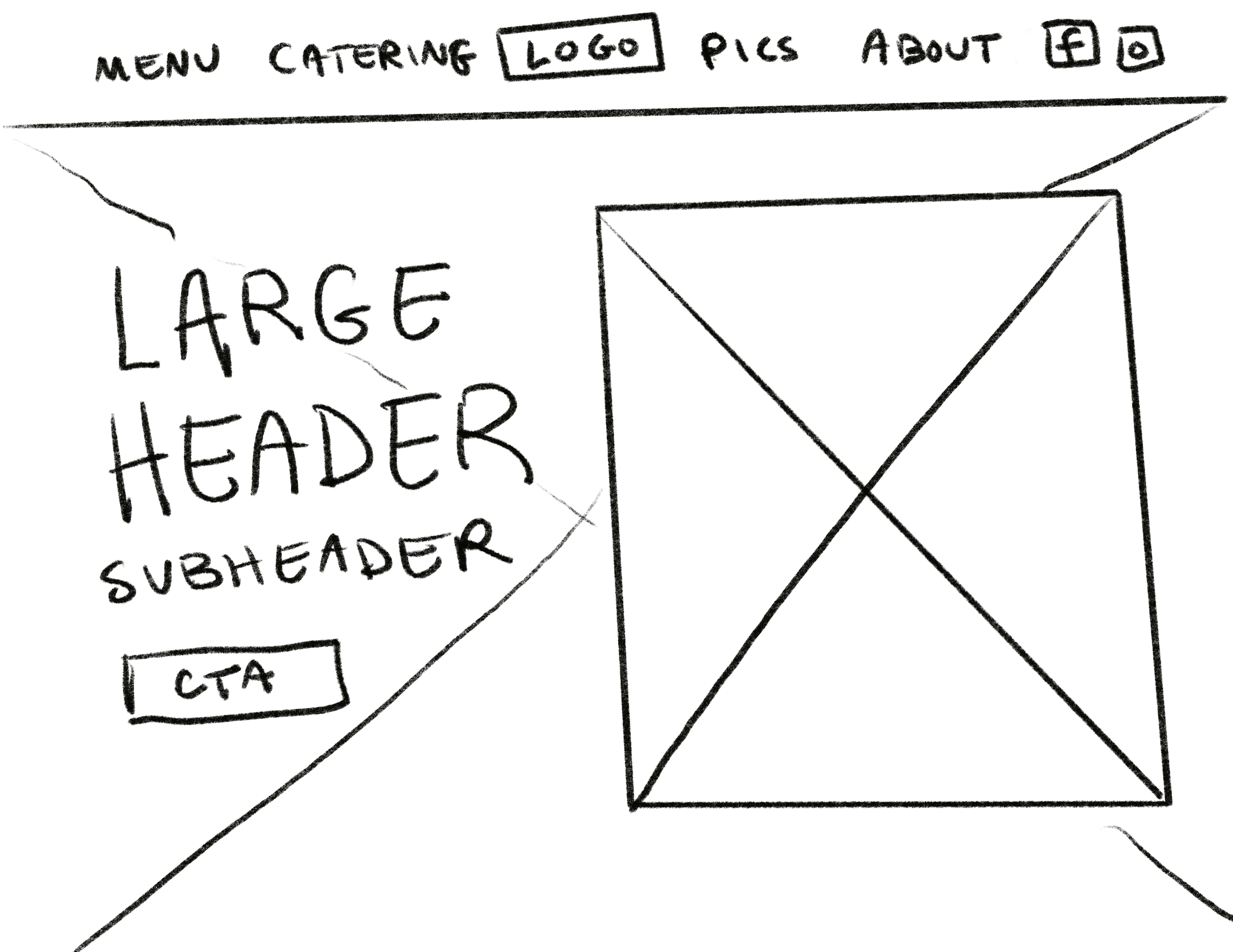
The goal of the Frozen Fantasy website's user experience and interface design process was to translate the brand's warm and inviting nature into a digital experience that was both practical and emotionally captivating. Wireframe sketches were made to outline the main layout easy navigation and convenient access to important navigation like menu items, event reservations, and an about page. In order to meet the needs of both busy adults and younger users, user personas were used to help in guiding the features on the website and content hierarchy.
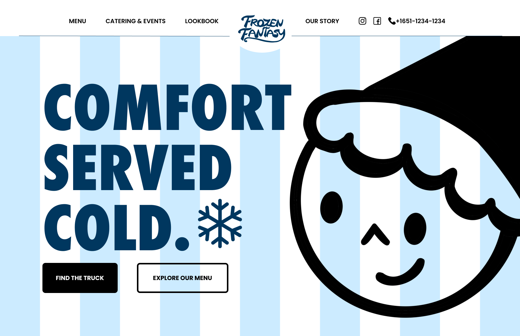
I proceeded to create high-fidelity mockups in Figma, using the brand's visual system to make the wireframes come to life. This included the logo, color palette, and typefaces. Focus was placed on components that support the brand's tone and the finished interface design prioritizes a seamless online experience.