
The Oracle
Client Project
Redesigning a website and logo to enhance Hamline University Saint Paul’s Campus Newspaper online presence and increase engagement from the campus community.
Project details
4 Months Duration
Tools Used: Adobe Photoshop, Adobe Illustrator, Figma, Procreate, SNO (Word press platform)
Website Design, Logo Design, Marketing Materials Design, Newspaper Illustrations
What I created:
Website Redesign
Logo Design
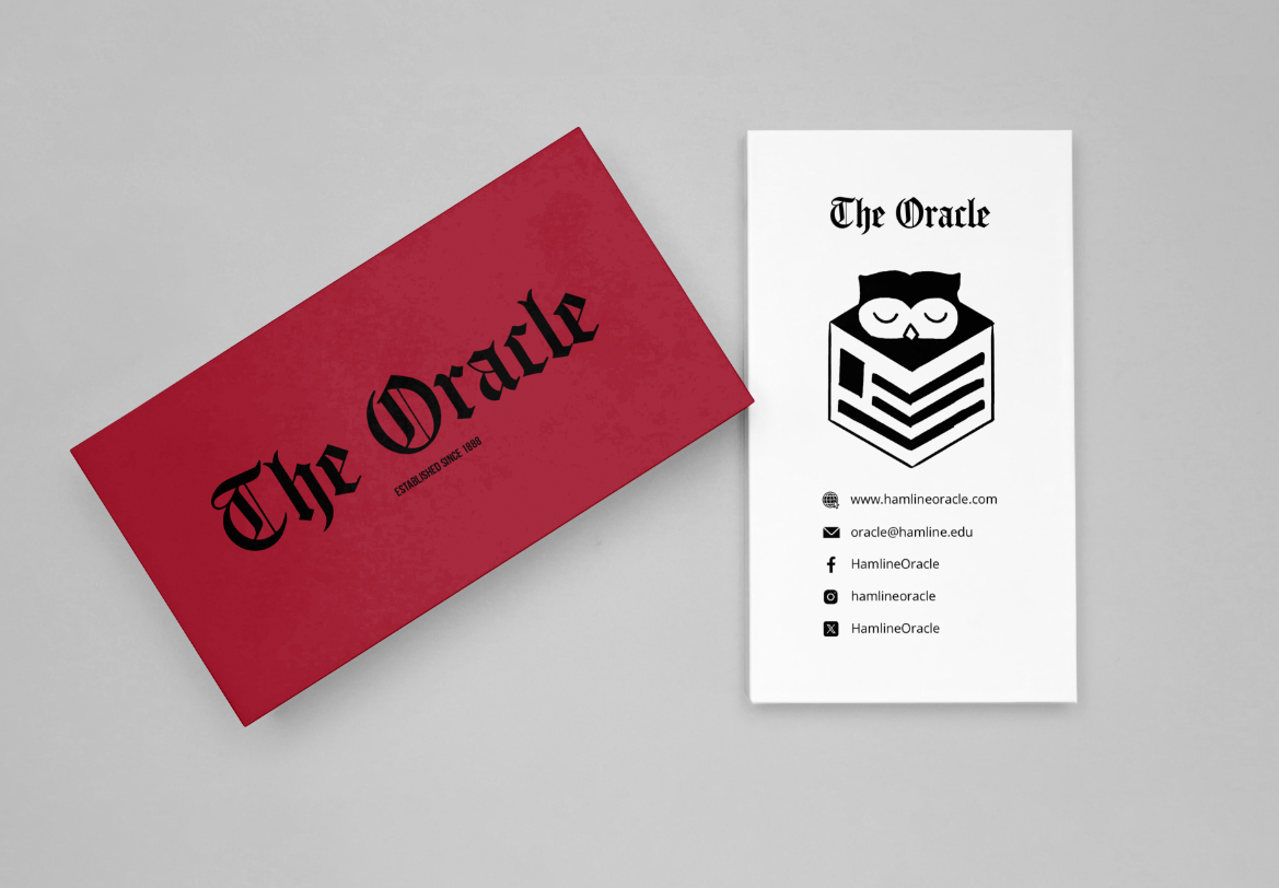
Business Card and Merch Design
Illustrations for news articles
Introduction

Hamline University Saint Paul’s campus newspaper called The Oracle aims to to cover news, trends, events and entertainment relevant to Hamline undergraduate students. The Oracle strives to make their coverage accurately reflect the diverse communities that comprise the student population.
Client Need
The Oracle is seeking a refreshed visual identity that better represents its student-run publication and engages its audience. The project includes a website redesign from it’s already existing website to improve usability and accessibility, a new logo to modernize the brand, and a set of custom illustrations that can be used throughout the school year to enhance news articles and create a cohesive visual style.
Website Redesign
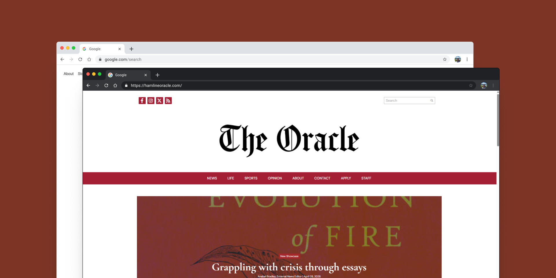
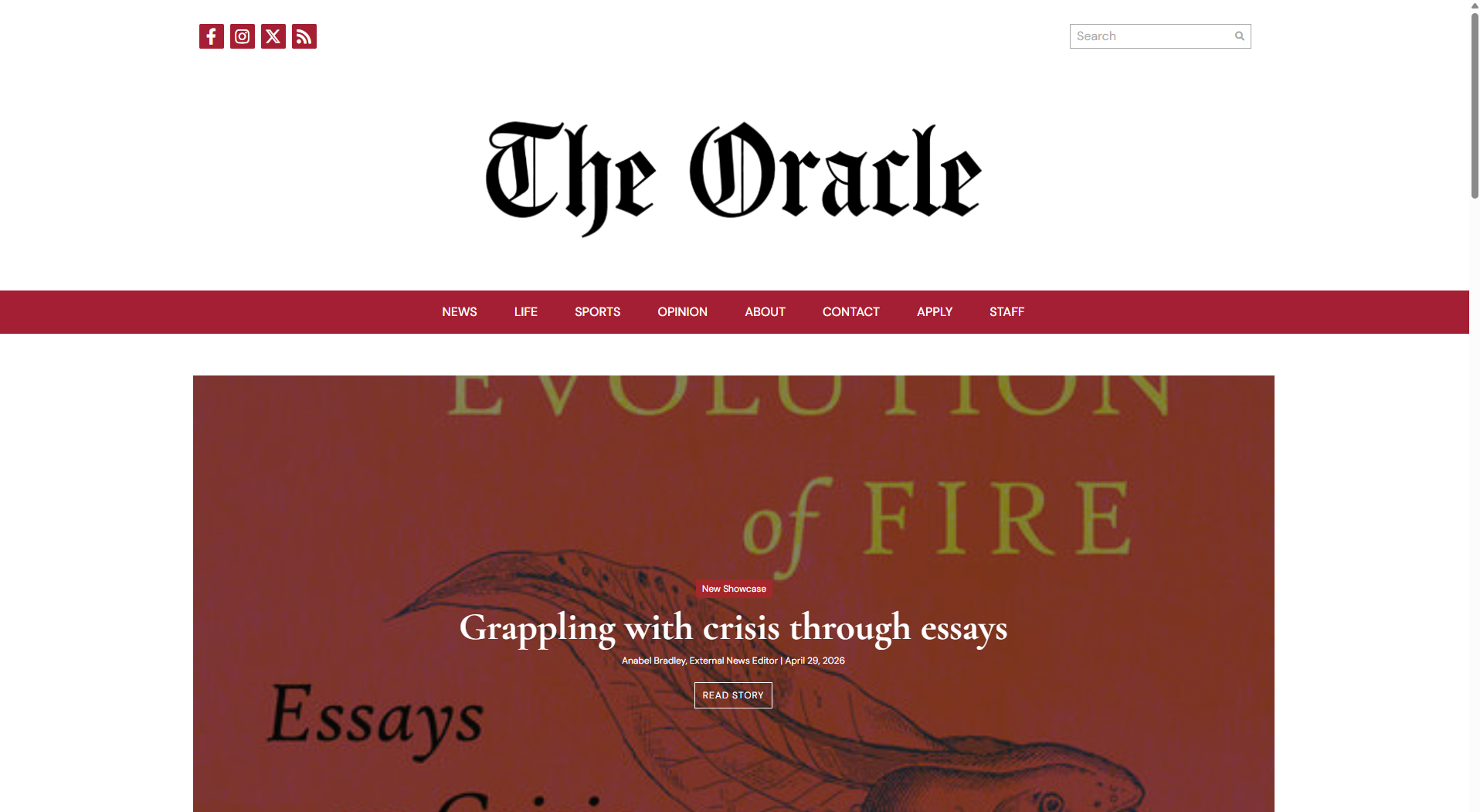
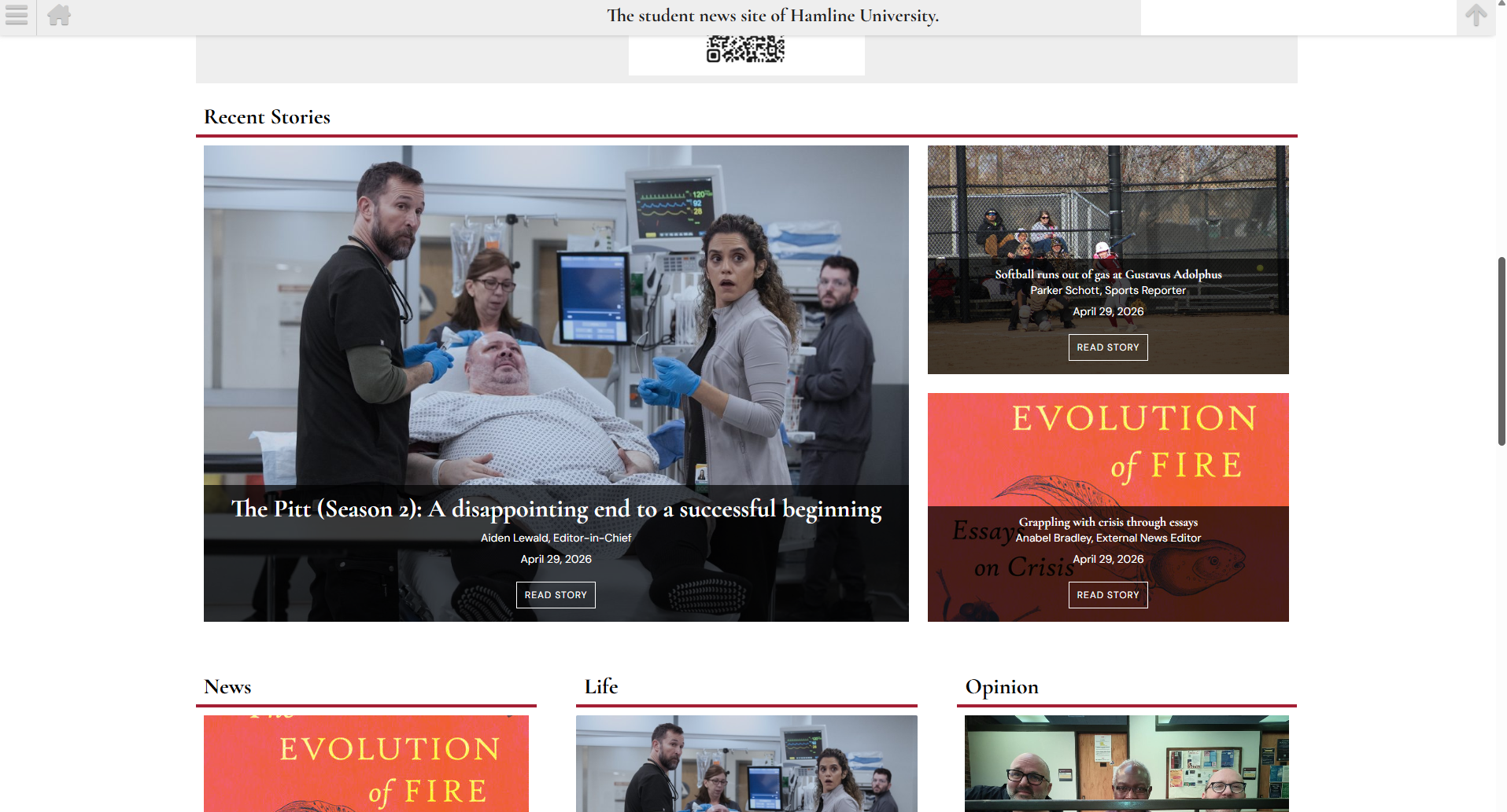
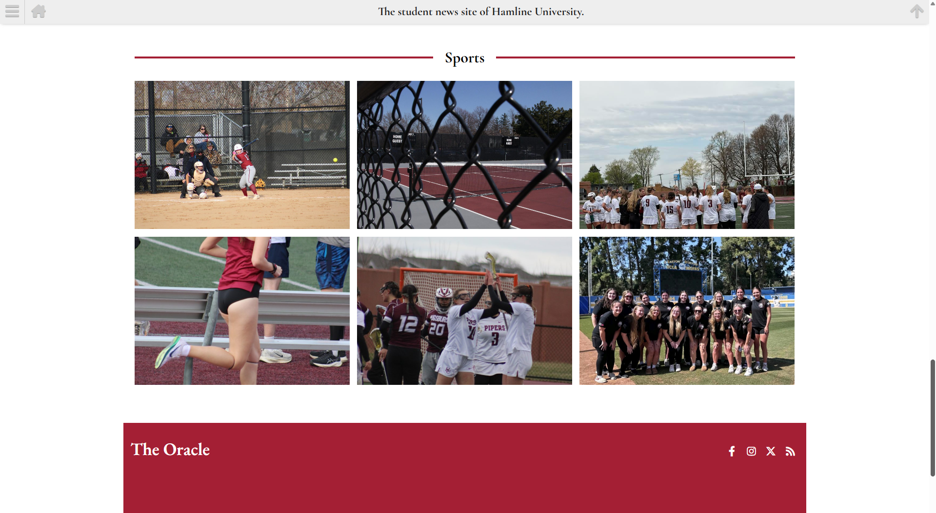
The website redesign focused on improving readability, navigation, and the overall user experience while giving The Oracle a more modern and cohesive visual identity. The new layout emphasizes featured stories, simplifies access to news categories, and creates a cleaner interface that encourages readers to explore content across desktop and mobile devices.
Competitive Analysis
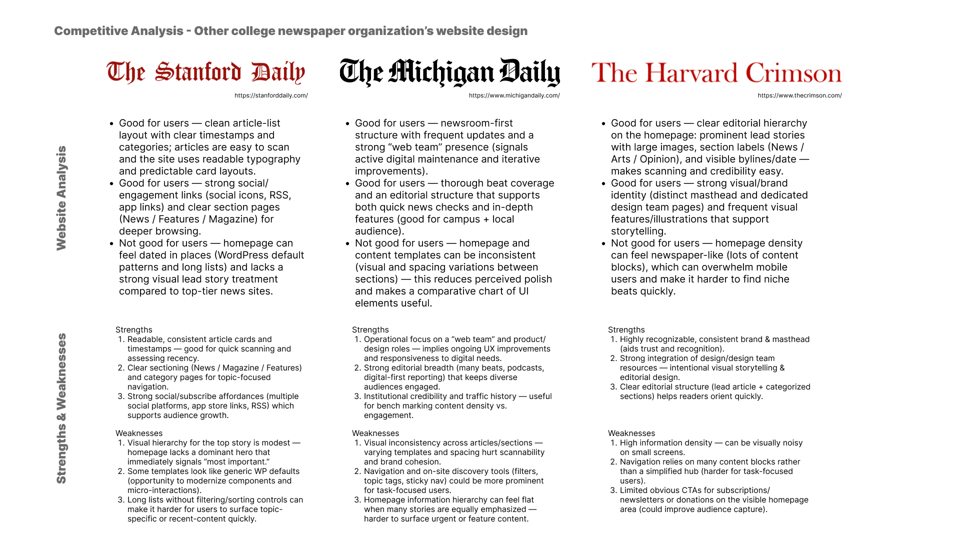
To inform the redesign, I analyzed the websites of three other collegiate newspapers to identify common design patterns, navigation structures, and content organization strategies. This research helped determine best practices for presenting articles, highlighting featured stories, and creating an intuitive reading experience while identifying opportunities for The Oracle to establish its own visual identity on the new website design.
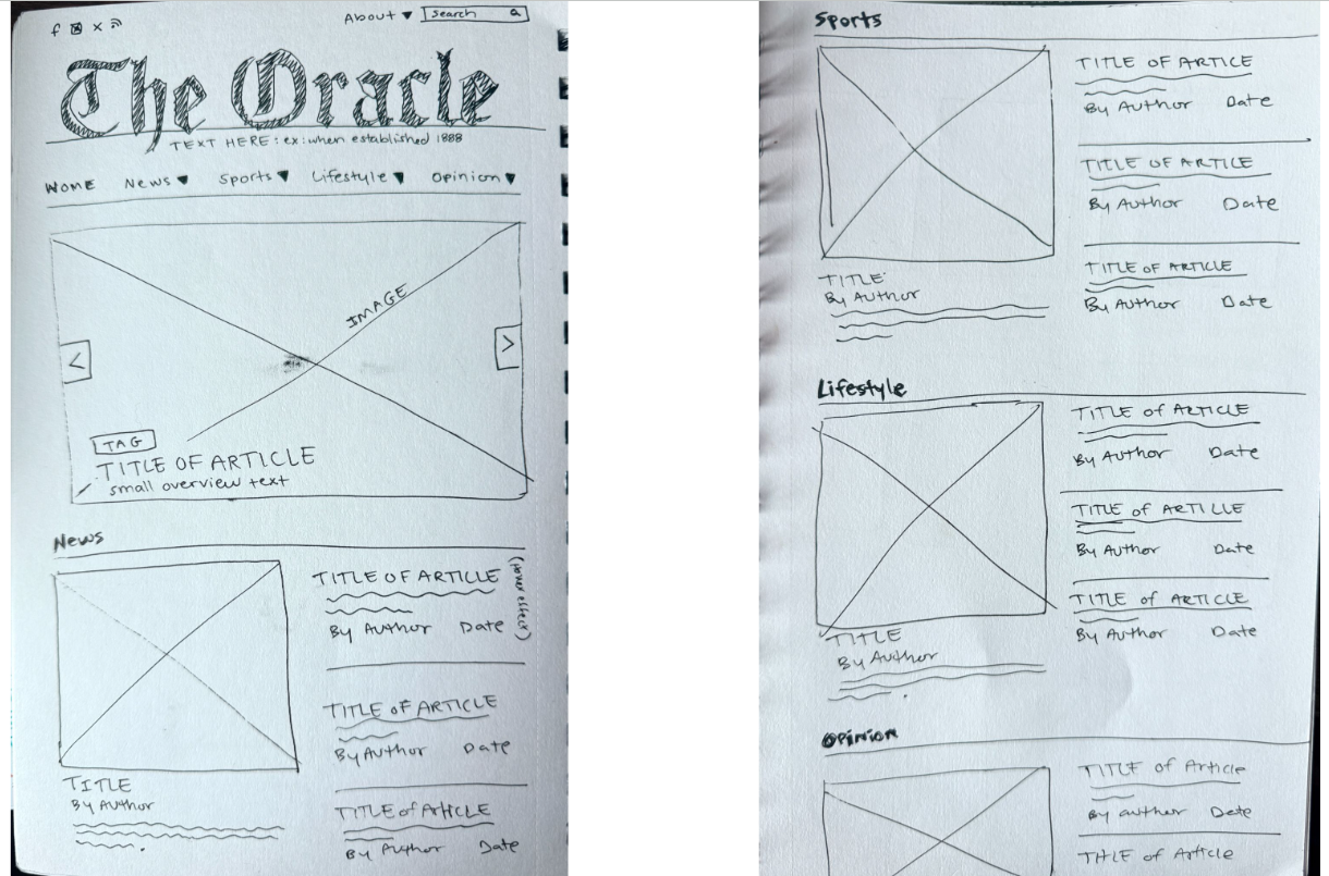
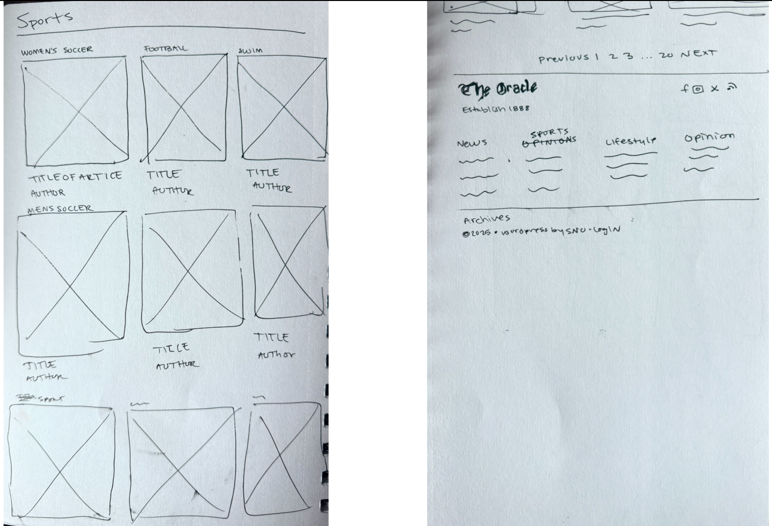
Initial Page Sketches
Initial page sketches and wireframes were created to explore layout options, establish the site's information hierarchy, and refine the user experience before moving into high-fidelity designs. This planning process made it possible to organize content effectively, test navigation concepts, and ensure each page supported a clear and intuitive reading experience.
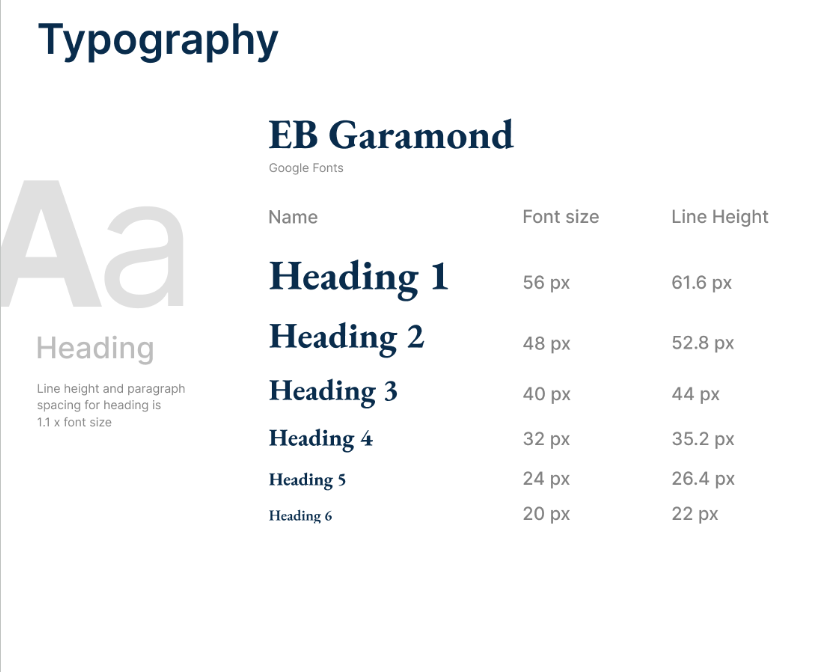
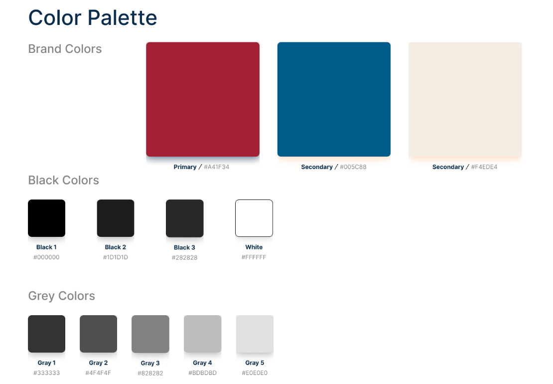
UI Kit Design
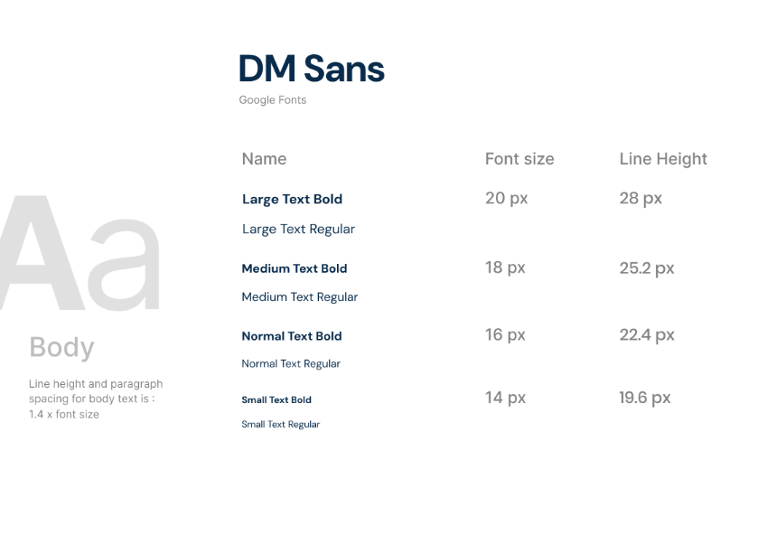
A UI kit was developed to establish consistent typography, colors, buttons, icons, and interface components across the redesigned website. Since The Oracle's website is built on the School Newspapers Online (SNO) WordPress platform, the design was created within the limitations of the existing theme and content management system, balancing creative improvements with the platform's technical constraints.
Official Final Website Designs
Logo Design
The Oracle wanted to preserve the recognition and history of its existing wordmark while expanding its visual identity with a new icon logo. Rather than replacing the established wordmark, the goal was to create a complementary symbol that could be used across digital platforms, social media, merchandise, and other branded materials where a more compact logo is needed. The new icon was designed to align with The Oracle's identity as a trusted, student-run news publication while providing greater flexibility and consistency across a variety of applications.
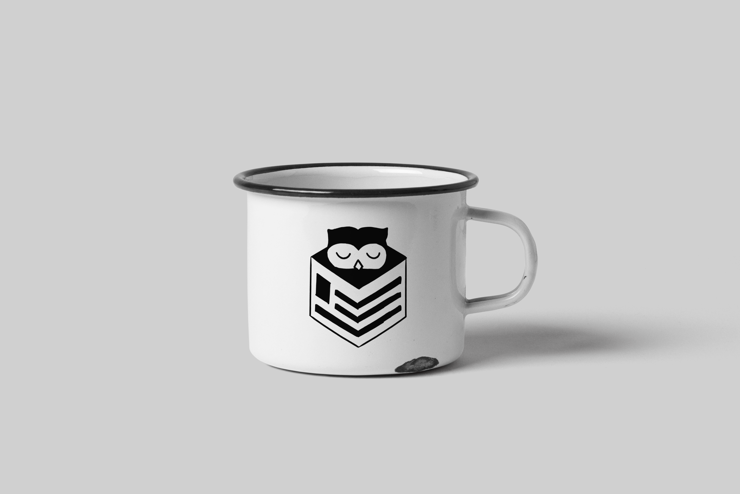
Icon Logo
The logo features a sleeping owl nestled inside a cube-shaped box that incorporate geometric elements inspired by a folded newspaper. The owl symbolizes wisdom, knowledge, and thoughtful journalism. The newspaper-inspired cube reinforces The Oracle's identity as a news publication, creating a distinctive icon that balances playful character with clean geometric design.

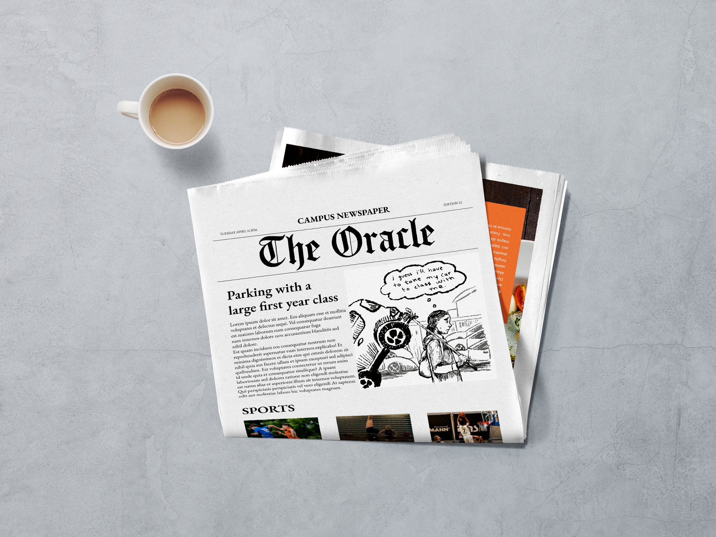
Newspaper and Mug Mockups
Business Card Design
Illustrations
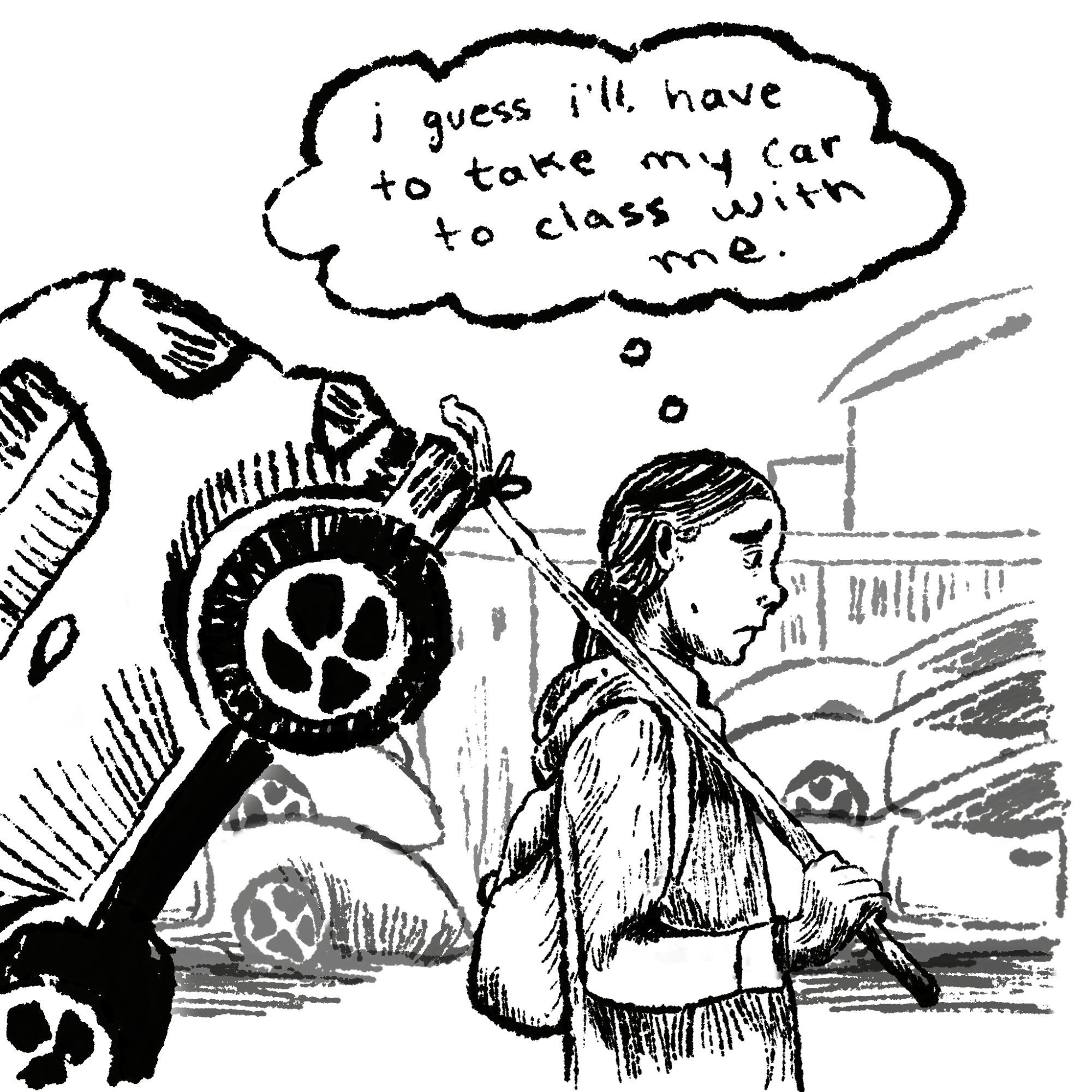
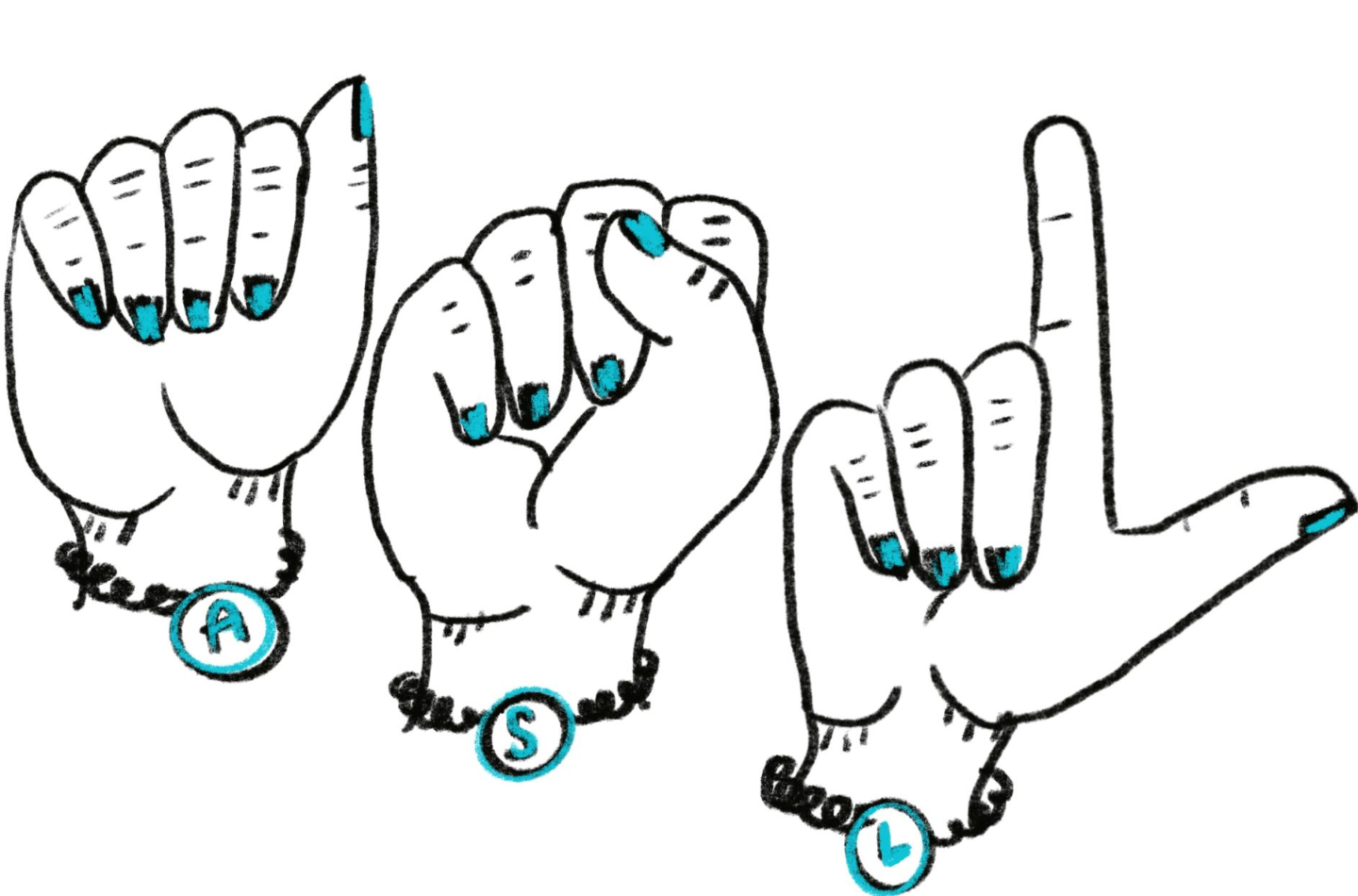
Throughout the school year, I created a variety of editorial illustrations to accompany news articles on a wide range of topics. Because each story covered a different subject, every illustration was designed with a unique concept while maintaining a consistent visual style. These graphics helped communicate complex ideas, added visual interest to the publication, and supported readers' engagement with each article.